I was trying to figure out what the opposite color of brown was a week ago, and I found this website with a great color tool. I have strong instincts about what colors to use, but sometimes I get a bit stuck or don’t know which color would look best. To be honest, I feel like the range of colors we have here on planet earth is pathetically small. I know for sure that in other dimensions there must be far greater ranges. So often I’m looking for a color, and I think, “Is that all there is? Is that all the choices I have?”
Do you ever feel that way about food? Sometimes I have the same feeling with food. Like I want something, but it’s not anything that I can think of that exists– cheese or bread or wine or chocolate or lemon or what-have-you.
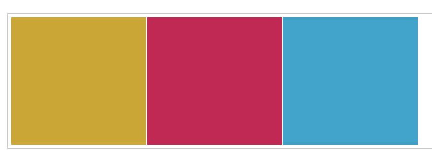
Complementary colors are interesting. They are not at all what I would expect them to be. Here, for example, is a pair of complementary colors:
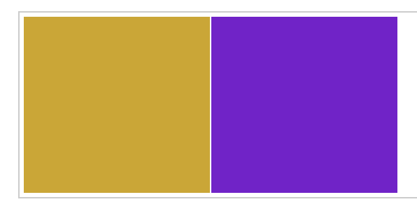
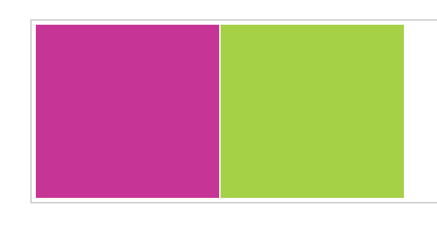
I think of them more as opposite colors. I mean, they look really cool together, but you probably have to have an artist’s eye to agree with that. Remember when pink and green was such a popular color combination? When preppy was in? Those are complementary colors, in the technical sense. I mean, if my mother were using the term “complementary colors,” she certainly wouldn’t put yellow and purple together. It’s interesting– the website lets you choose color “harmonies.” So it’s kind of like music where you can choose a note, and then find other notes that are in harmony with it by going up or down a certain number of steps.
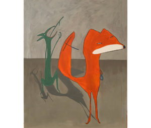
Anyway, I was making a drawing in my journal this morning, and I used the tool. I started with this:
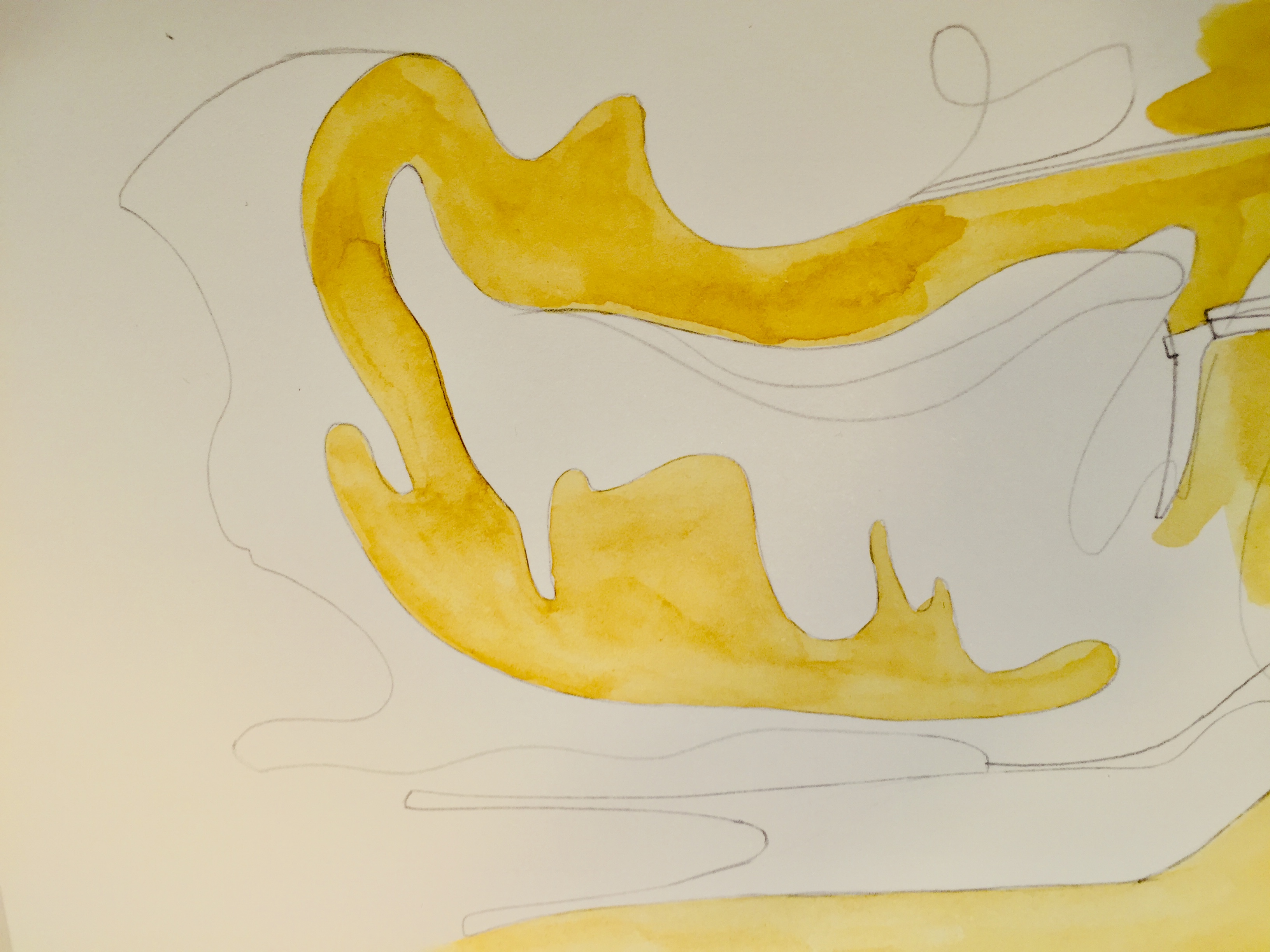
Well, this was a part of the drawing. I uploaded it to my computer, figured out the color number values of the yellow in Photoshop, then I plugged them into the color calculator and got the complementary color. It’s the first image in the post. I don’t like purple so I didn’t use it; instead I ended up trying the “triadic harmony,” which is this:
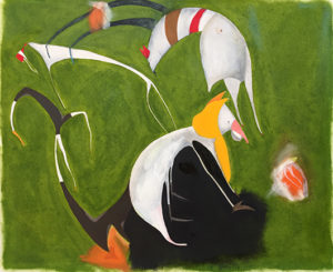
This is the final drawing:
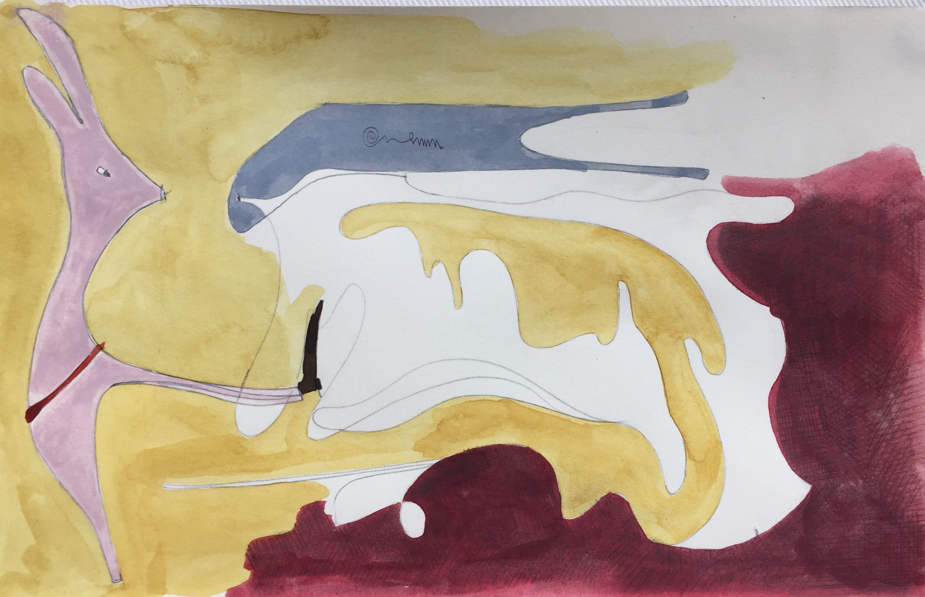
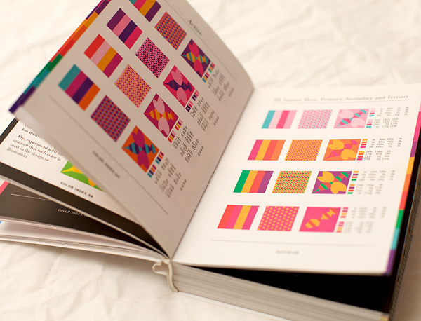
Initially the red part was brighter and redder, like the swatch above, but I didn’t like how it looked so I darkened it with pencil/graphite. To be honest, I don’t like the color scheme very much, and I was reminded of another time I tried using pre-set color schemes to color my drawings. I have a color book called Color Index by Jim Krause with “over 1100 color combinations,” and I tried taking color combinations from the book.
It’s funny though, I had the same feeling then– that they look good in the book, but they’re not what I want. Though sometimes what I paint isn’t what I want either.
I haven’t drawn in my journal in a week. I’ve been working on our Christmas card and Christmas things. When I don’t draw for a while, I think my first drawings are bad. It’s like the way you need to run water through pipes that haven’t been used for a while to get the dirty water out first, before the clean water comes through.